Designing a Mobile-First AI-Guided Solar Purchase Experience
TIME
12 MonthS
ROLE
pRODUCT dESIGNER

Team components
mANAGEMENT
Product mANAGER
Development
Front-end developers
SEC.
/OVERVIEW
tHE overview
The Context
SunnyAI replaced the traditional solar sales rep — a mobile-first, AI-native platform taking homeowners from address input to signed contract, guided by AI.
Solar is a high-consideration, long-commitment purchase. Operating as an AI-powered sales tool for local installer partners, we still couldn't get users through the flow — initial conversion was **0%**. With ~80–90 users entering monthly and a 10-sale target, something in the experience was failing at every step.
I led the end-to-end experience as the sole designer from 0→1 — every flow, from quoting through financing.

Initial Hypothesis — And Where It Failed
We optimized for speed: fast, self-serve, cheaper than competitors. Users engaged — explored sizing, reviewed projections — but nobody completed financing.
Engagement was there. Completion wasn't.
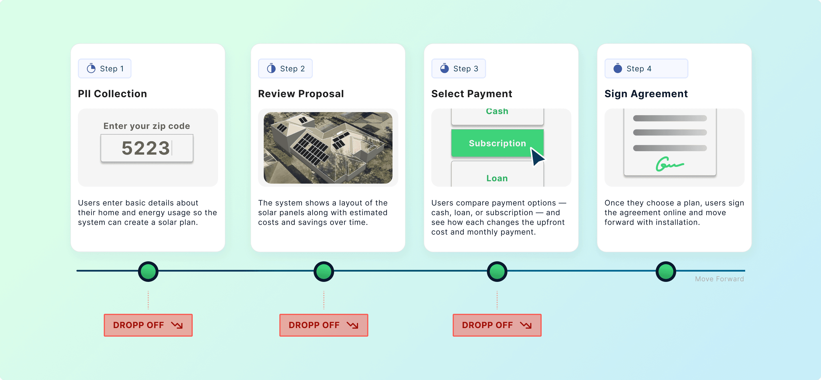
Funnel analysis and session recordings revealed three drop-off clusters, each a different trust threshold: PII collection, proposal review, financing.
SEC.
/Breakdown 1
Breakdown 1 — PII Friction: Commitment Before Clarity
Method: Funnel Analysis + Marketing Expert Consultation
Funnel data showed a sharp drop-off before users had seen a proposal. Our hypothesis: we were asking too early — requesting personal data before demonstrating any value.
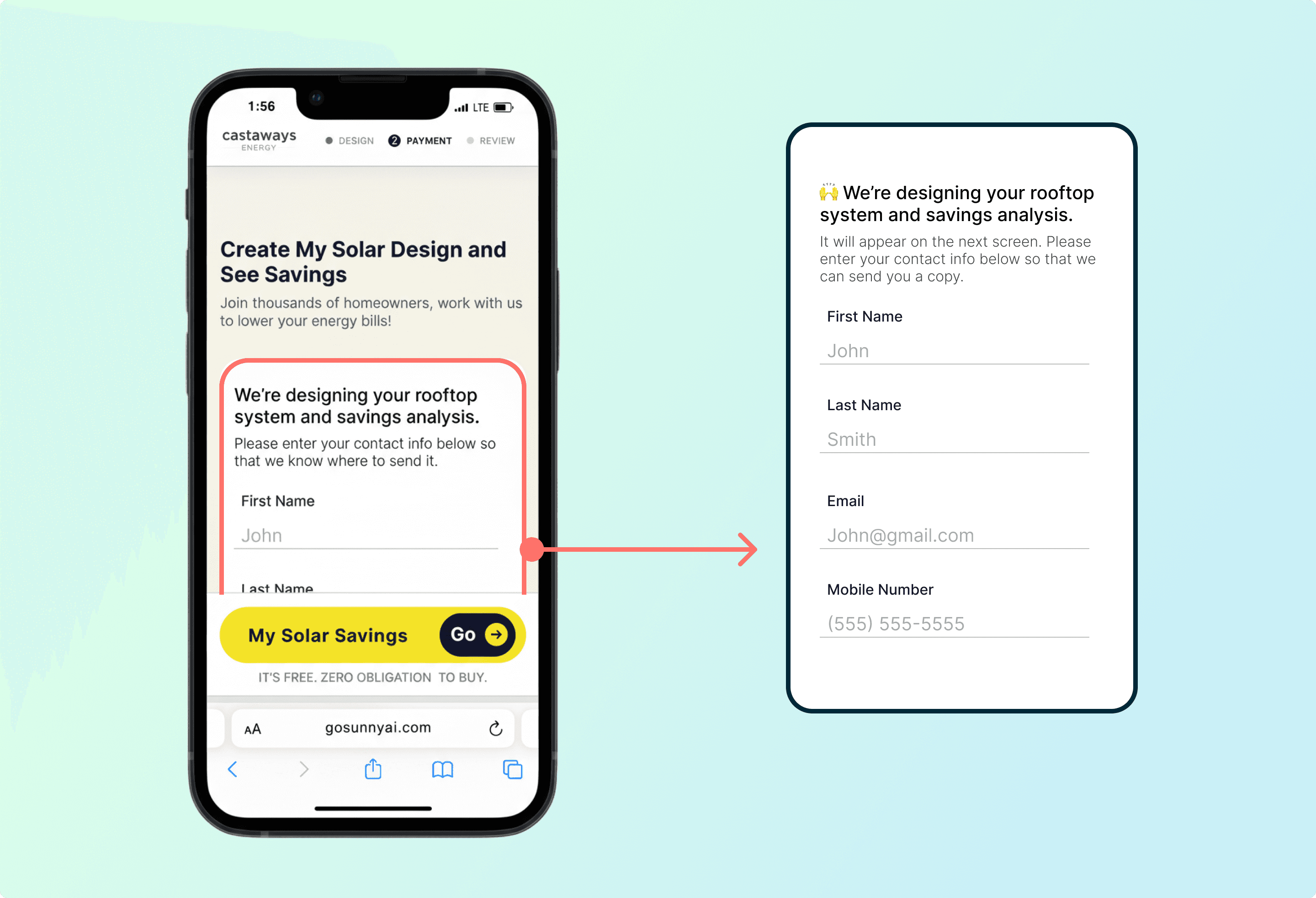
Early Version – Long Form on the landing page
We consulted a marketing specialist focused on conversion and user acquisition, who confirmed it and introduced the concept of the "yes-train": each small commitment lowers resistance to the next, but only if the user has received something in return first.
Design rationale:
Instead of collecting all inputs upfront, I broke the flow into single-question pages. Each page explained why we were asking — a short line of context directly beneath the input — and the next page delivered a value beat in return.
The form wasn't shortened. It was restructured: one ask at a time, reason given, value returned — a commitment ladder where every yes was earned, not extracted.

Early Version – Long Form on the landing page
Result
Early abandonment decreased. More users reached the proposal stage — exposing the next problem.
SEC.
/Breakdown 2
Breakdown 2 — Proposal Friction: Invisible Scaffolding
Method: Behavioral Pattern Analysis + Synthesis Mapping
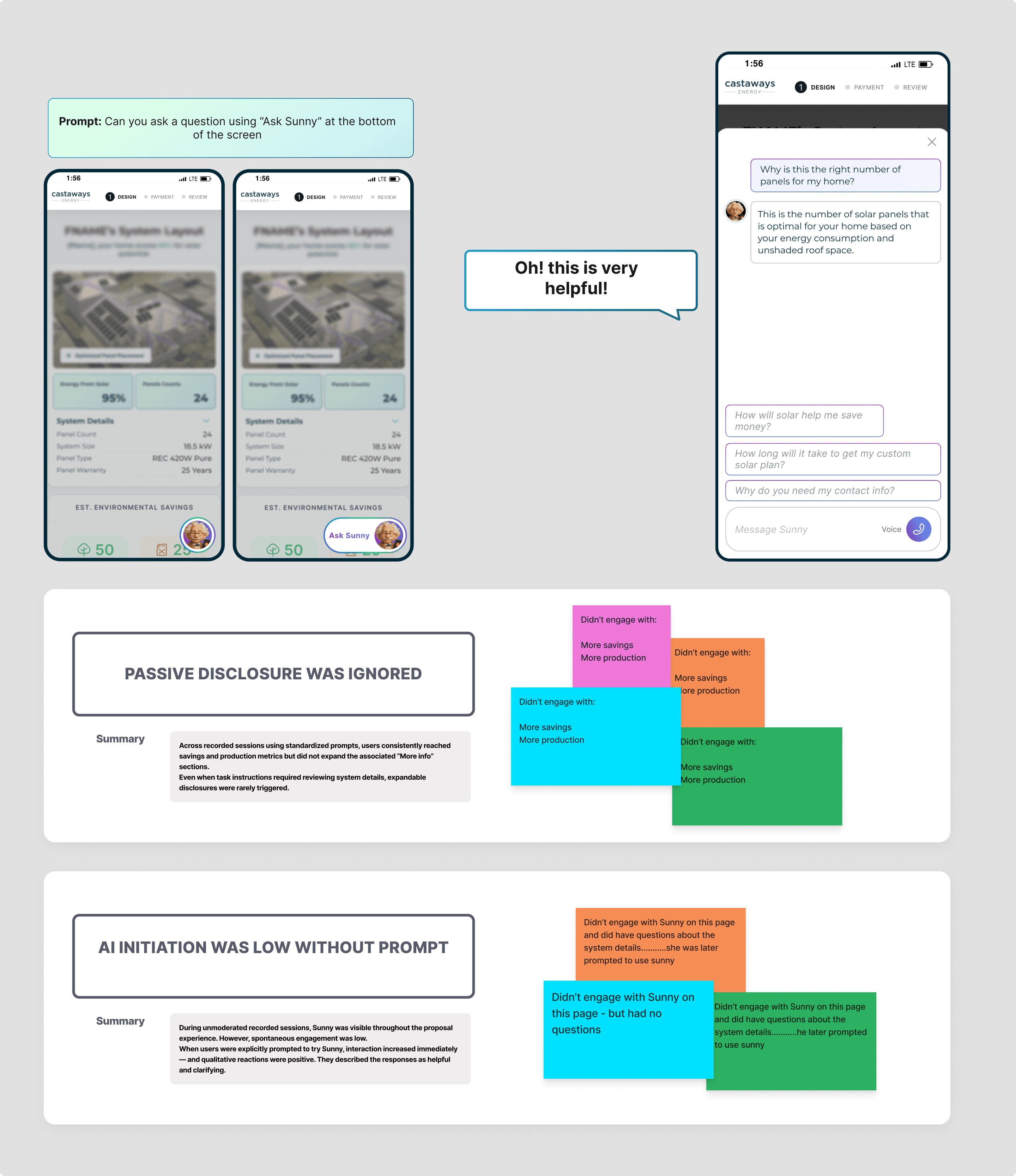
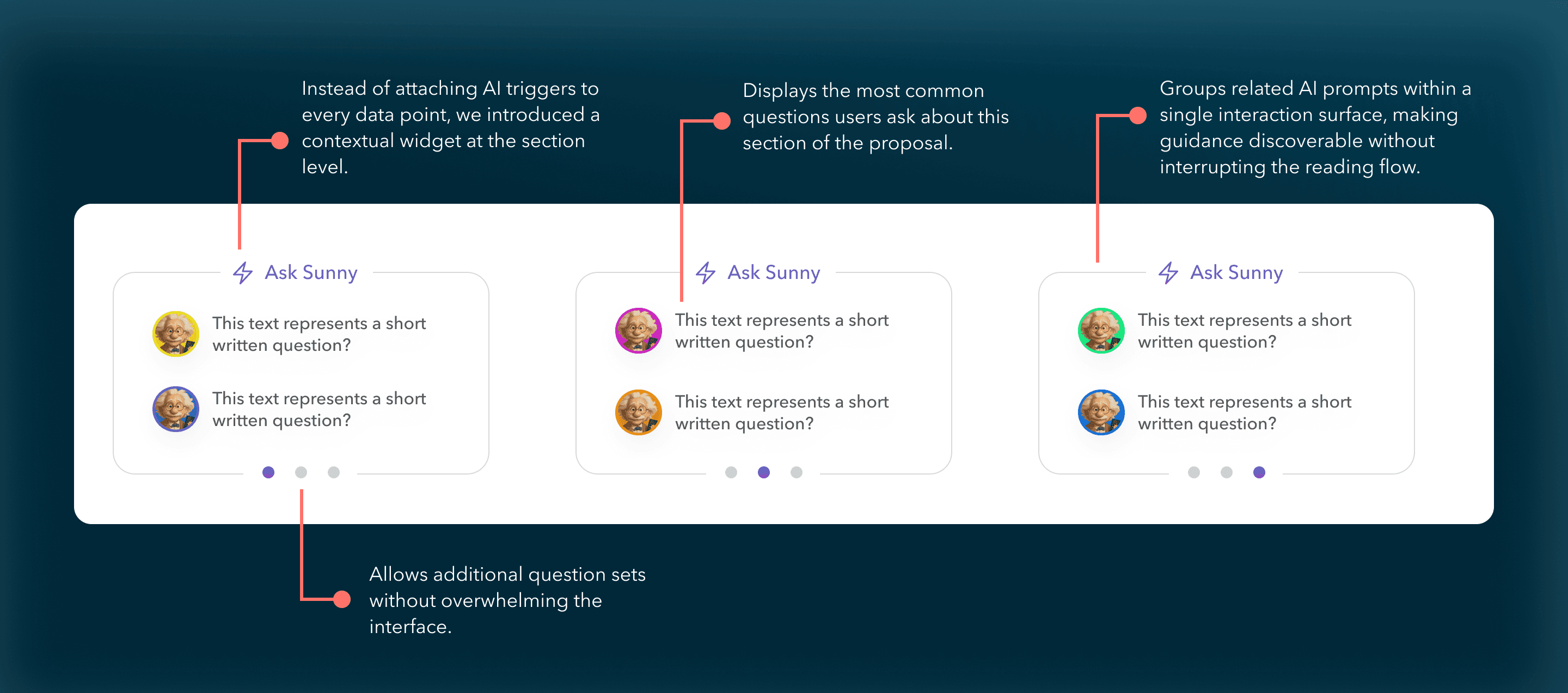
As we reviewed recorded sessions of the proposal stage, a consistent pattern emerged. Users would scroll steadily, slow down around savings projections or system details, linger for a moment — and then move on or exit. The AI assistant was visible throughout as a floating entry point, but spontaneous activation was rare.
What stood out wasn’t confusion in navigation. It was hesitation around interpretation. And when users were prompted to try Sunny, engagement increased immediately — the responses were described as helpful and clarifying. The assistant worked. The initiation didn’t.
*Floating Chat widget in the pervious experience
What This Actually Means:
"Sunny" worked — but it depended on users recognizing their confusion and choosing to seek help. Most users don’t explicitly seek help in complex flows. They either push through or leave.
design exploration:
Sunny could not remain a passive floating tool — users weren’t activating it.
But making it proactive risked interrupting an already dense financial experience.
The solution couldn’t be “make it louder.”
It had to reduce activation friction without increasing cognitive noise.
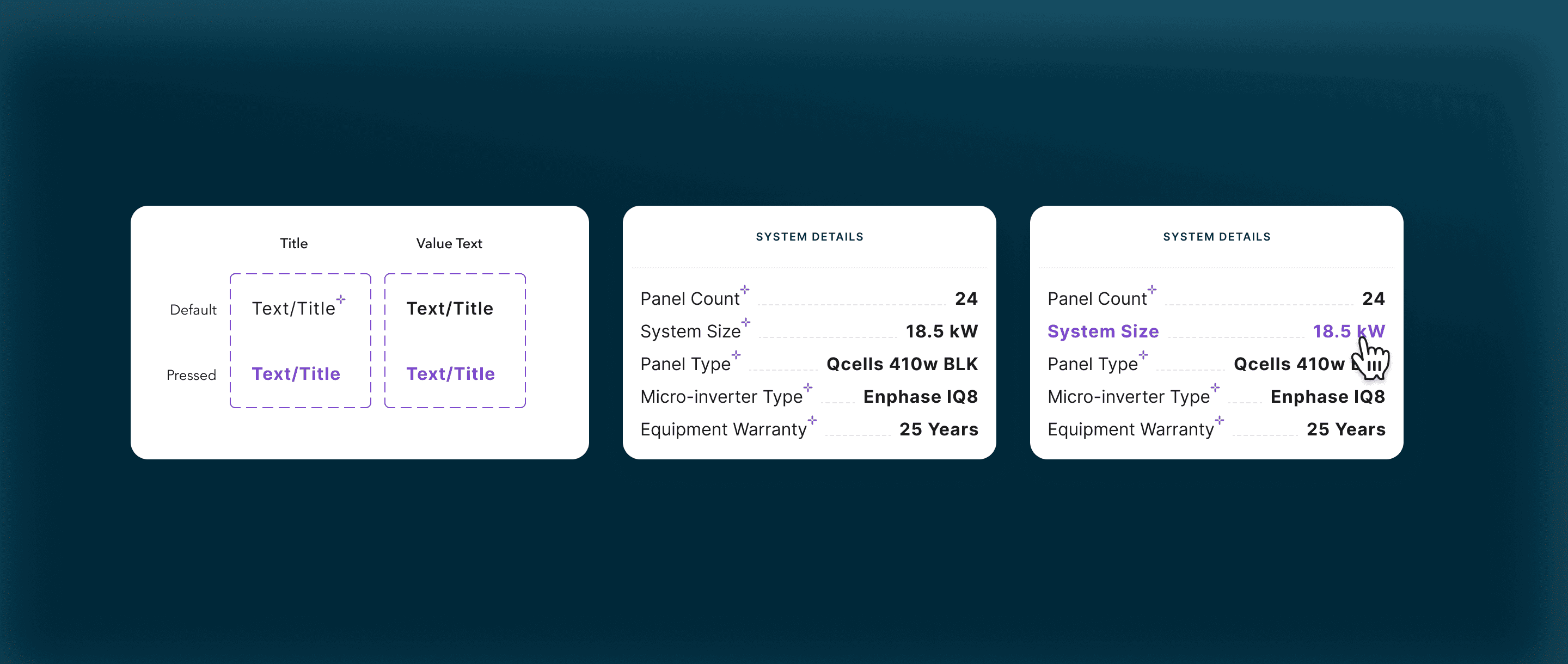
Item-Level AI Triggers:
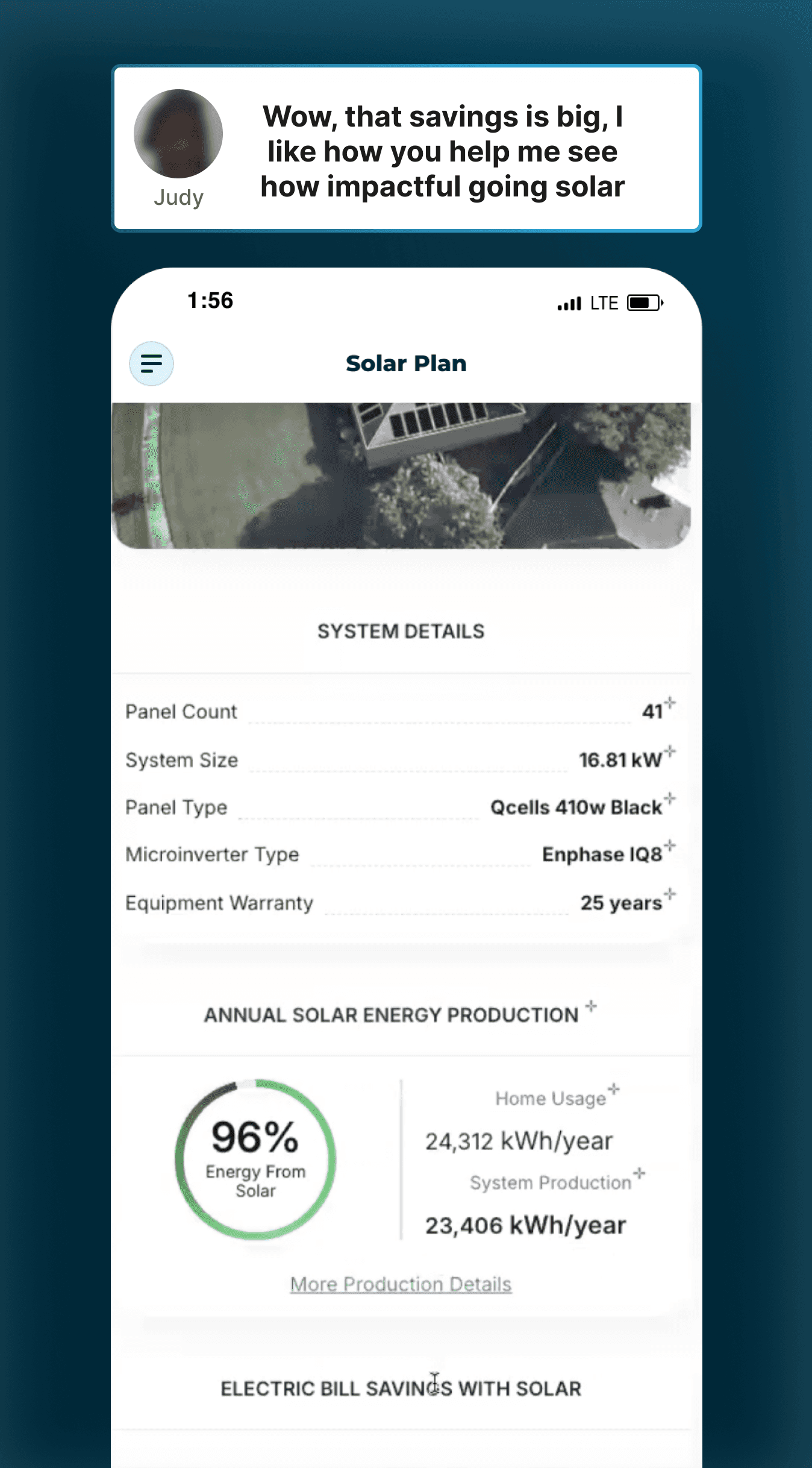
One early direction we explored was placing an AI entry point next to every proposal item. The idea was simple: if users hesitated around specific metrics — system size, panel type, warranty — they could immediately ask Sunny about that exact detail.
Each label would include a small interaction cue, allowing users to open the chat directly from that field and ask questions about it.
At first glance, this seemed like the most direct way to reduce activation friction. Instead of asking users to formulate a question or navigate to the assistant, every data point would become an entry point to explanation.

*Floating Chat widget in the pervious experience
However, when we tested this structure, we observed something important about how homeowners actually evaluated the proposal.
Most participants did not spend time examining the system specifications. Instead, they quickly moved past the technical configuration and focused almost entirely on the financial outcome — particularly projected savings and energy coverage.
Across testing sessions, four out of five participants skipped the system details section altogether and navigated directly to the savings summary.
This shifted our understanding of where interpretation was actually needed.
*Floating Chat widget in the pervious experience
Final Direction — Section-Level Guidance
Attaching AI triggers to every technical item would have created unnecessary interaction points in areas that users rarely engaged with, We moved the AI interaction up one level — from individual data points to the section level.
This approach kept the interface visually cleaner while aligning AI guidance with the parts of the experience where users naturally paused and asked questions.
*Section-level widget displaying suggested questions users can ask Sunny.
Extending the Experiment: Can AI Fully Replace the Rep?
After embedding contextual AI and increasing engagement, we wanted to understand whether the system could support full self-serve contract signing.
We introduced two parallel paths at the final decision point:
Proceed to sign independently
Speak with a sales advisor
This allowed us to observe whether improved interpretive support translated into independent commitment.
The behavioral signal was clear.
Customers who completed contracts consistently chose to speak with a human before signing.
AI improved understanding.
Human interaction unlocked commitment.
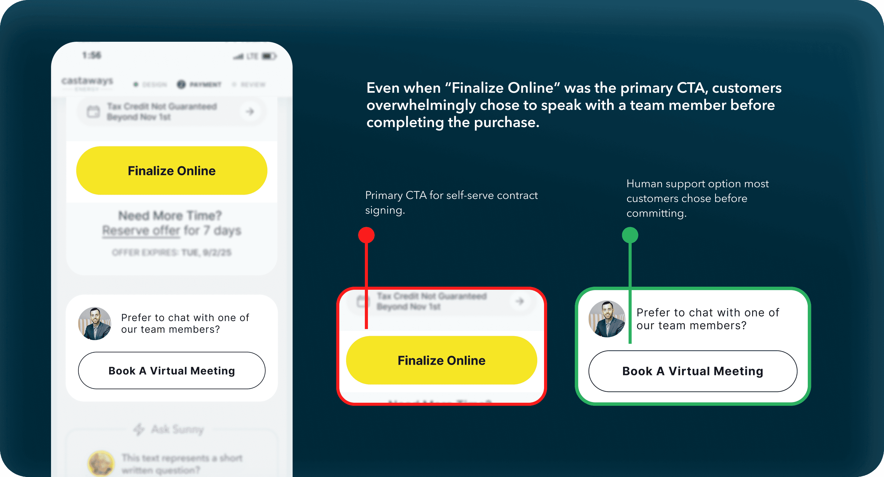
*Final decision point offering two paths: complete the purchase online or speak with a team member.
Strategic Learning
The original hypothesis assumed AI could replace the salesperson entirely.
What we discovered was more nuanced.
AI successfully replicated the explanatory function of a rep — helping users interpret system sizing, savings assumptions, and financing structure.
But in a zero-brand trust environment and a high-dollar, long-term commitment, emotional reassurance still required human presence.
The result wasn’t abandoning AI.
It was redefining its role.
Sunny shifted from replacement to amplifier:
AI scaled interpretation.
Humans closed trust.
SEC.
/Breakdown 3
Breakdown 3 — Financing Architecture: Designing for Confidence
Method: Session Data + Domain Knowledge + Competing Layout Sketches + Iterative Design Review
In traditional solar sales, the rep does the confidence-building work, helping customers understand what each option means for their situation. Sunny had removed that layer entirely. Users weren't missing information. They were missing the ability to translate that information into a decision they felt good about.
Our design goal became concrete: we wanted someone to walk away understanding what each plan protects them from, instead of just what it costs. That's what gets people to actually commit.
The design problem had three parts, and we had to solve them together
The first was a UX and product tension at the same time: a stakeholder proposed auto-recommending subscription and reducing visible options to simplify the decision. I pushed back. In this context, limiting choices doesn't read as helpful, it reads as steering. Users needed to feel they were choosing, not being guided toward what benefited the business. That advocacy and the UX problem were the same question: *how do you show three plans fairly on a mobile screen, without making comparison feel like work?*
The answer was a tab architecture: Cash, Loan, and Subscription as equal top-level tabs with identical layout and instant switching. Stacking three plans vertically on mobile would have forced too much scrolling, and users would lose track of what they were comparing. Tabs preserved comparison without demanding effort. The system could guide. It could not trap.
The second dimension
The second part was what information goes where. I sketched four competing layout structures and brought them into design review. The layered approach won because it forced a single clarifying question: *what three numbers does a user need to hold in their head when they close this page?* From that: monthly payment, monthly savings, before vs. after utility bill. Those three became visually dominant in every plan tab. Everything else (projections, rate assumptions, compliance details) moved into expandable sections below. Nothing removed. Everything structured around what actually drives a decision.
The third dimension
The third was how each plan communicated its real value. "Lease" carried heavy negative associations in solar: asset extraction, lock-in, complexity. We renamed it "subscription," which more accurately reflected what it was: maintenance included, warranty covered, predictable monthly cost. But naming alone didn't move behavior. Cross-industry analysis of SaaS and home services revealed why: subscription models win not on ROI, but on *risk reduction*. I redesigned the plan card to lead with what subscription actually protects against (zero upfront, no surprise costs, no ownership complexity) instead of competing on long-term savings numbers it would lose.
The result:
Users began choosing based on what fit their situation rather than defaulting to the plan with the biggest savings number. Subscription adoption grew. Only once it became the most-selected plan did we update the label to "Most Popular," reflecting actual behavior, not aspiration. Cash and Loan stayed fully visible throughout.
SEC.
/The Outcome
The Outcome
Quote completion improved from **0% to ~25%**, and sales conversion from **0% to ~20%**, over monthlong iterations. Against ~80–90 monthly users and a 10-sale target, that was real evidence the experience was actually working. Users were leaving the financing stage able to clearly articulate what they'd pay and save, instead of bouncing at the first moment of confusion.
**If rebuilding:** The subscription messaging evolution was informed by funnel data and behavioral observation, not formally A/B tested. That's the piece I'd validate more rigorously.
view Other
work
work.
/next


Email • WAGAODESIGN
Email • WAGAODESIGN

